
Learning how to read a stock chart on the NSE for the first time is less about pattern recognition and more about reading four pieces of information in a fixed sequence: price, time, volume, and the moving averages overlaid on price. Indian retail investors typically encounter charts on broker platforms like Zerodha Kite, Upstox, or Groww, all of which present TradingView-style candlestick charts by default. The first hour of chart reading goes badly when a beginner jumps straight to candlestick patterns; it goes well when they learn the layout first. This article is educational, not trading or investment advice; charts describe what has already happened, not what will happen.
This guide walks through the basic chart layout, what each element represents, the standard timeframes Indian retail investors should use, the role of volume and moving averages, and a simple reading sequence you can apply to any NSE stock chart in under two minutes. The goal is not to predict price; it is to read what the chart is telling you about historical behaviour and current trend.
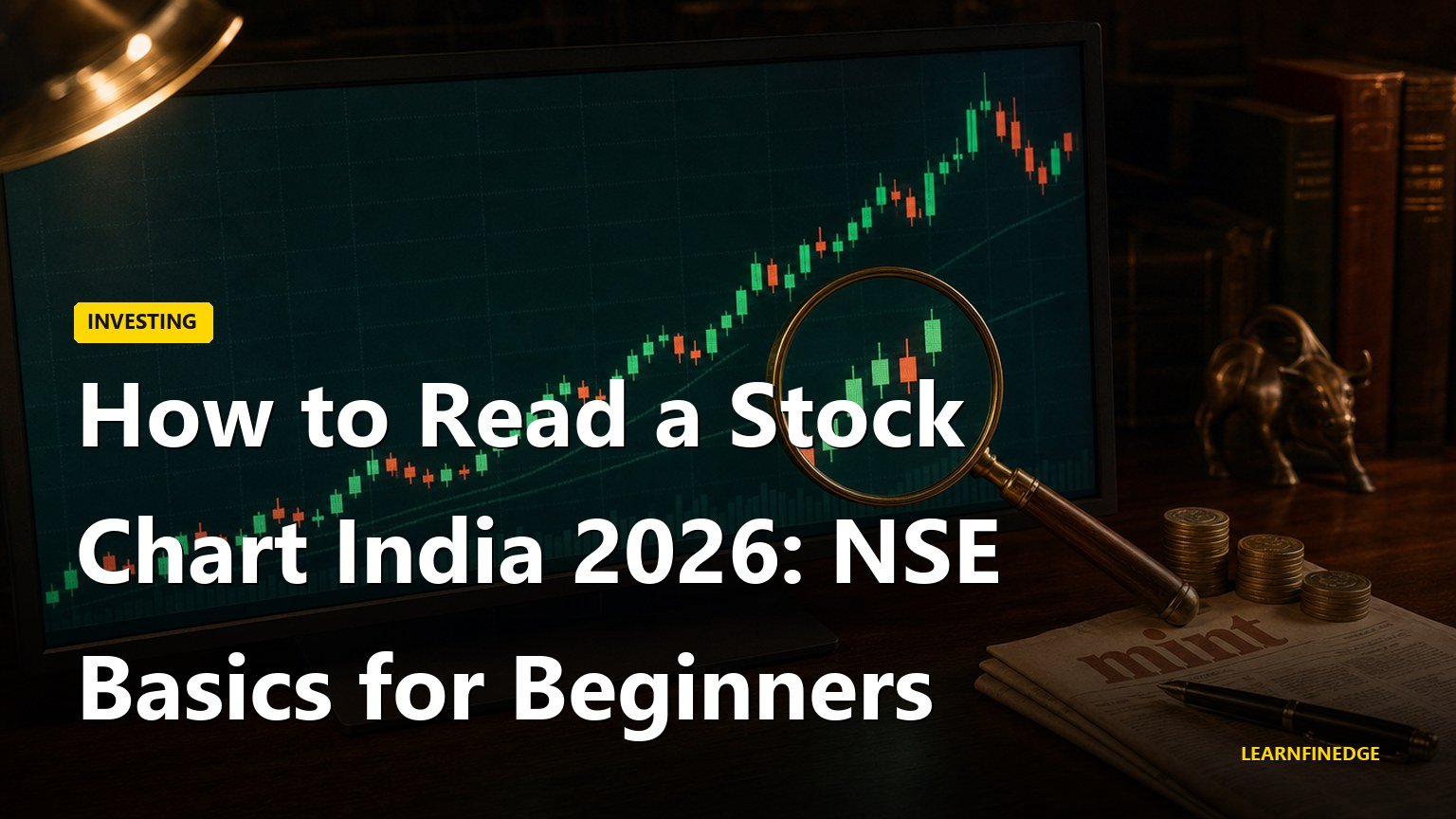
What a candlestick chart actually shows
A candlestick on an NSE chart represents the price action of the stock for a fixed time interval, with four data points: open, high, low, and close (OHLC). On a daily chart, each candle is one trading day. On a 15-minute chart, each candle is 15 minutes. The body of the candle is drawn between the open and close prices; the thin lines above and below (the wicks or shadows) extend to the high and low prices reached during the interval.
A green or hollow candle means the close was higher than the open (the stock rose during the interval). A red or filled candle means the close was lower than the open (the stock fell during the interval). The colour convention is consistent across Indian broker platforms; only the exact shade differs. The body length shows the size of the move from open to close; the wick length shows the volatility within the interval.
The most common alternative is a line chart, which connects only the closing prices and ignores intraday range. Line charts are cleaner for showing trend over very long periods (5 years and above) but hide the volatility information that candles capture. For most retail decisions, candles on a daily timeframe are the right starting point.
Choosing the right timeframe before doing anything else
The chart timeframe should match your decision horizon. A long-term investor reviewing an annual SIP holding should look at weekly or monthly charts. A swing trader holding for a few days to a few weeks should look at daily charts. An intraday trader uses 5-minute, 15-minute, or hourly charts. Looking at a 5-minute chart to make a long-term investment decision adds noise; looking at a monthly chart for an intraday decision misses the relevant action.
For an Indian retail investor making a first attempt at chart reading, the daily timeframe with a one-year lookback is the right anchor. It shows roughly 250 trading days, which captures full earnings cycles, major news events, and the general trend strong enough to read. The weekly chart with a five-year lookback is the natural complement for the same stock; it strips out daily noise and shows the multi-year direction.
NSE Pre-open session prices (9:00 AM to 9:08 AM), the main session (9:15 AM to 3:30 PM), and the post-close session (3:40 PM to 4:00 PM) are all reflected in the chart, but only main-session candles are meaningful for technical reading. Pre-open prices are discovery prices, not trade prices, and post-close session prices typically have very low liquidity.
Reading volume the right way
The volume bars below the price chart show how many shares changed hands in each interval. Volume is the single most informative supporting metric on a chart because it tells you the conviction behind a price move. A 5 percent up-day on twice the average volume carries more weight than a 5 percent up-day on half the average volume.
For NSE-listed large-cap stocks, the average daily volume runs in the millions of shares; for mid-caps in the hundreds of thousands; for small-caps and SME-listed names, often in the tens of thousands or lower. The absolute number matters less than the volume on a given day relative to the trailing 30 or 50 day average for that specific stock. Most charting platforms overlay a volume moving-average line for this comparison.
Two patterns are worth learning early. The first is a strong upward price move on high volume, which usually indicates institutional accumulation. The second is a strong downward price move on high volume, which usually indicates institutional distribution. These two patterns are the foundation of most volume-based reading, and beginners can rely on them before adding more complex tools. For a deeper read on the supporting discipline, see Position Sizing MWPL India.
The two moving averages every Indian retail chart should carry
A moving average smooths the price line by averaging the last N days of closing prices. The 50-day and 200-day simple moving averages (SMA) are the two most widely watched lines on Indian stock charts. The 50-day SMA reflects the medium-term trend; the 200-day SMA reflects the long-term trend.
When the current price is above the 200-day SMA, the stock is in a long-term uptrend in the conventional definition. When it is below the 200-day SMA, the stock is in a long-term downtrend. The 50-day SMA crossing above or below the 200-day SMA is the well-known “golden cross” and “death cross” signal, which has predictive value only in trending markets and is unreliable in choppy sideways markets.
For a first-time chart reader, the two moving averages provide an immediate visual anchor for the trend. You do not need to interpret crossovers as buy or sell signals; you only need to read whether the price is above or below the longer-term line. That single piece of information is often more useful than a dozen pattern-recognition tools.
A simple chart-reading sequence in five steps
Work through this sequence the first time you open any NSE chart. It takes about two minutes per stock and surfaces the key information without requiring any pattern-recognition skill.
- Step 1: Set the timeframe. Daily chart, one-year lookback. Switch to weekly for the same stock to confirm the multi-year direction.
- Step 2: Identify the trend. Is the current price above or below the 200-day SMA? Is the 50-day SMA above or below the 200-day SMA? An uptrend has price above both and 50-day above 200-day.
- Step 3: Read the volume. Are recent moves on above-average or below-average volume? Look at the volume bars on the last 10 to 20 candles relative to the volume moving average.
- Step 4: Mark obvious support and resistance. Draw horizontal lines at price levels where the stock has reversed direction multiple times in the lookback window. These are practical reference points, not predictive lines.
- Step 5: Check the news context. A chart never explains itself. Pair the technical reading with the recent quarterly earnings, sector news, and any corporate action.
What charts cannot tell you
A stock chart cannot tell you why a price moved, only that it did. The reason might be earnings, sector rotation, regulatory news, a global macro event, or pure noise. Treating chart patterns as predictive in the absence of fundamental context is a common beginner mistake. Even experienced technical traders treat charts as one input among several, not the sole basis for decisions.
Charts also do not tell you about ownership structure, debt levels, profitability, or any of the fundamental metrics that drive long-term equity returns. For long-term investment decisions, the chart should be a supporting tool to a fundamental analysis, not the primary lens. The risk of becoming chart-fixated is highest for new investors, and the cost is paid in tax and brokerage from over-trading. See Trading Psychology India for the behavioural side of this.
The SEBI-published basics every retail investor should know
SEBI’s investor education portal publishes free guides on stock-market basics, including chart-reading fundamentals. These are issued for retail-investor protection and form the recommended starting point for any chart-reading study. SEBI also publishes the list of registered investment advisors and research analysts whom retail investors should rely on for personalised advice. Chart reading alone, without context, does not qualify as research, and the regulator regularly warns against unregistered chart-based advisory services on social media.
The NSE itself publishes free chart data and historical OHLC data for all listed stocks, accessible without a paid subscription. For the regulatory framework around investor education and registered research, see the published material at the SEBI website. The Investor Education and Protection Fund (IEPF) maintains structured beginner content under its investor-awareness programme.
Frequently Asked Questions About Reading a Stock Chart
What is the best chart timeframe for a beginner Indian investor?
The daily chart with a one-year lookback is the standard starting point for retail Indian investors. It shows roughly 250 trading days, which captures multiple earnings cycles and is long enough to identify the prevailing trend without being so short that intraday noise dominates. Pair it with a weekly chart on a five-year lookback for the same stock to confirm the multi-year direction. Shorter timeframes (5-minute, 15-minute, hourly) are appropriate only for intraday trading, which is not the typical retail use case.
What does a green candle versus a red candle actually mean?
A green candle means the closing price for that interval was higher than the opening price; the stock rose during the interval. A red candle means the close was lower than the open; the stock fell during the interval. The body of the candle is drawn between the open and close prices, and the thin wicks above and below extend to the intraday high and low. The colours are consistent across Indian broker platforms (Kite, Upstox, Groww, ICICI Direct), though the exact shade may differ.
Should I trust candlestick patterns like doji, hammer, and engulfing?
Candlestick patterns describe what already happened in one or two intervals; their predictive power is heavily debated in academic literature and is mixed at best. A doji shows indecision; a hammer shows a rejection of lower prices; an engulfing candle shows momentum. These are observations, not signals. Treating them as standalone entry triggers is a common beginner mistake. The patterns are most useful as a confirmation tool when other signals (trend, volume, fundamentals) already point in the same direction.
What is the simplest indicator beyond candles a beginner can use?
The 200-day simple moving average is the single most useful add-on for a beginner. It is a long-term trend indicator: when the current price is above the 200-day SMA, the stock is in a long-term uptrend by convention. When below, it is in a long-term downtrend. The 50-day SMA is a useful medium-term complement. Both lines are available as one-click overlays on Zerodha Kite, Upstox, Groww, and other Indian broker platforms.
Do I need a paid charting platform to read NSE charts properly?
No. The free charts on Zerodha Kite, Upstox, Groww, and the NSE India website are sufficient for retail-level chart reading. Free TradingView accounts also offer NSE data with basic indicators and patterns. Paid platforms add real-time data refresh on multiple symbols, advanced screener filters, and backtesting features that are useful only at higher activity levels. For long-term investors and casual chart users, the free options cover the full set of reading tools described in this guide.
How is volume different on the NSE versus the BSE?
The NSE has substantially higher cash-market volume than the BSE for most actively traded stocks; for many large-caps, NSE volume is 5 to 20 times the BSE volume. Charting and volume analysis are therefore typically done on NSE data. For stocks listed on both exchanges, the NSE chart is the more meaningful one for technical reading. The BSE chart can be used as a cross-check but should not be the primary source of volume analysis for dual-listed names.